Euro 2020
Role: Lead Graphic Design
Collaboration: Ali Uddin
Client: Sky Sports News
Brief
Make a brand for Euro 2020 and make it look good!
Context
For the football illiterate (like me) The 2020 UEFA European Football Championship, commonly referred to as UEFA Euro 2020 or simply Euro 2020, was the 16th UEFA European Championship, the quadrennial international men's football championship of Europe organised by the Union of European Football Associations (yes i pasted that from wiki). With it being one of the most viewed sporting events it was a no brainer to pitch for the project.
The brand for the original UEFA EURO 2020 was quite a diverse one with the concept incorporating all the major destinations hosting the event. That made for a difficult task as a concept based on one country or city was out of the question. Nothing to fret though as the brand had many other avenues that could be taken.
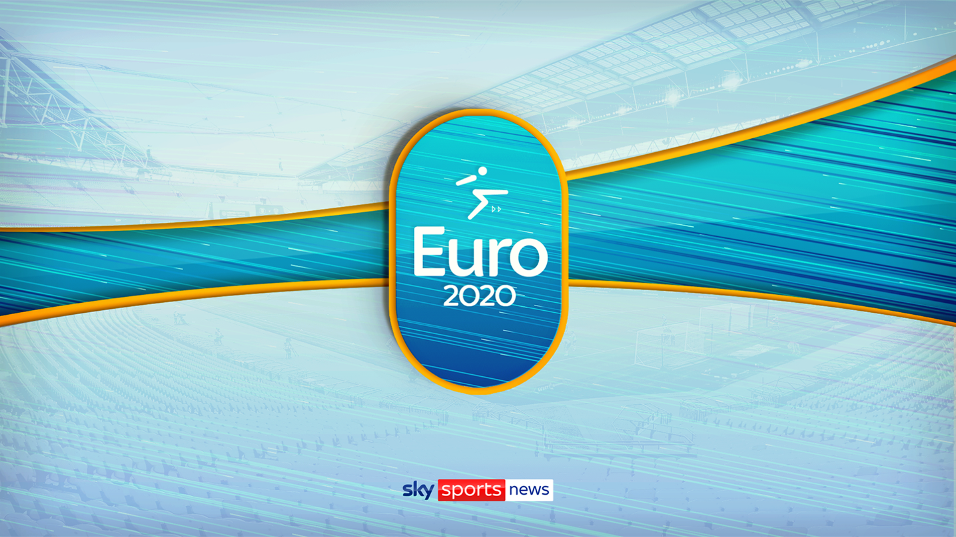
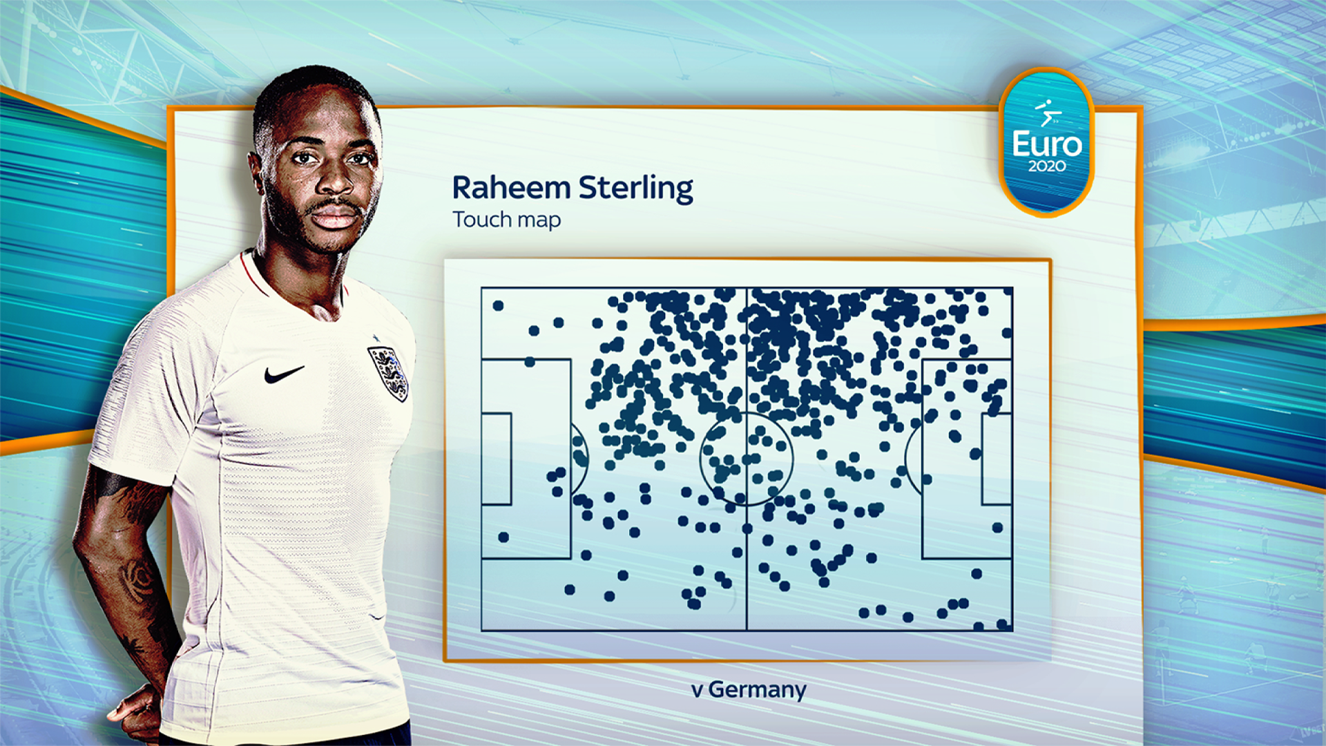
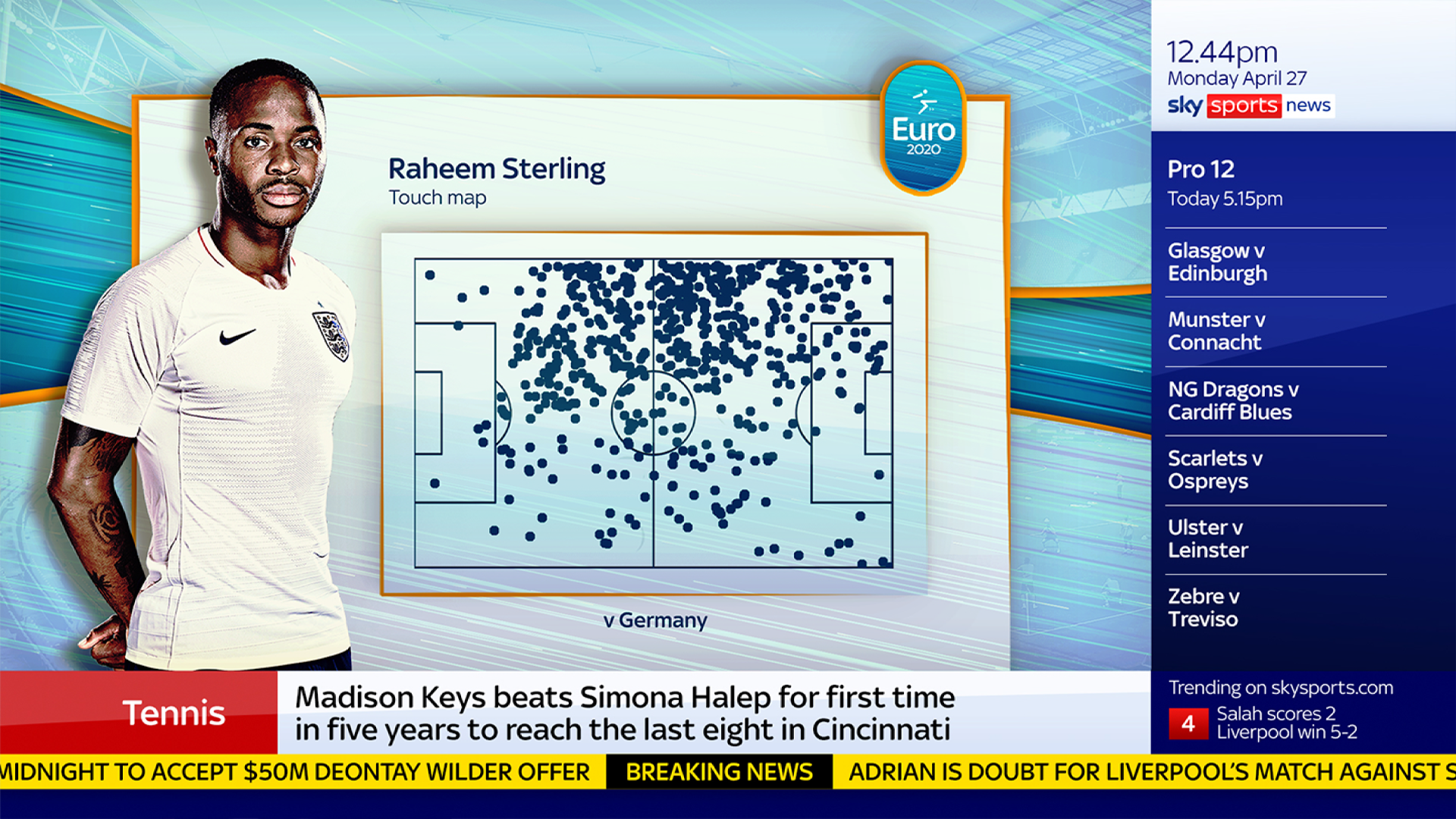
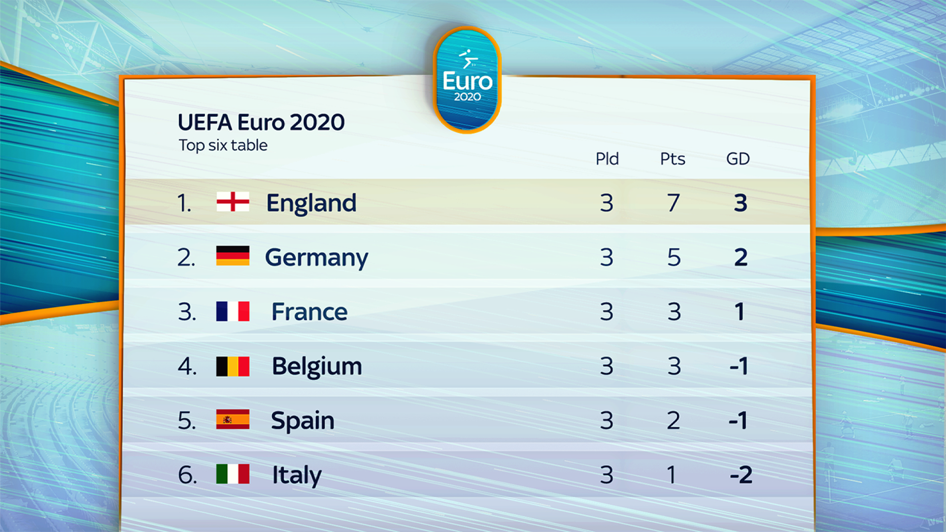
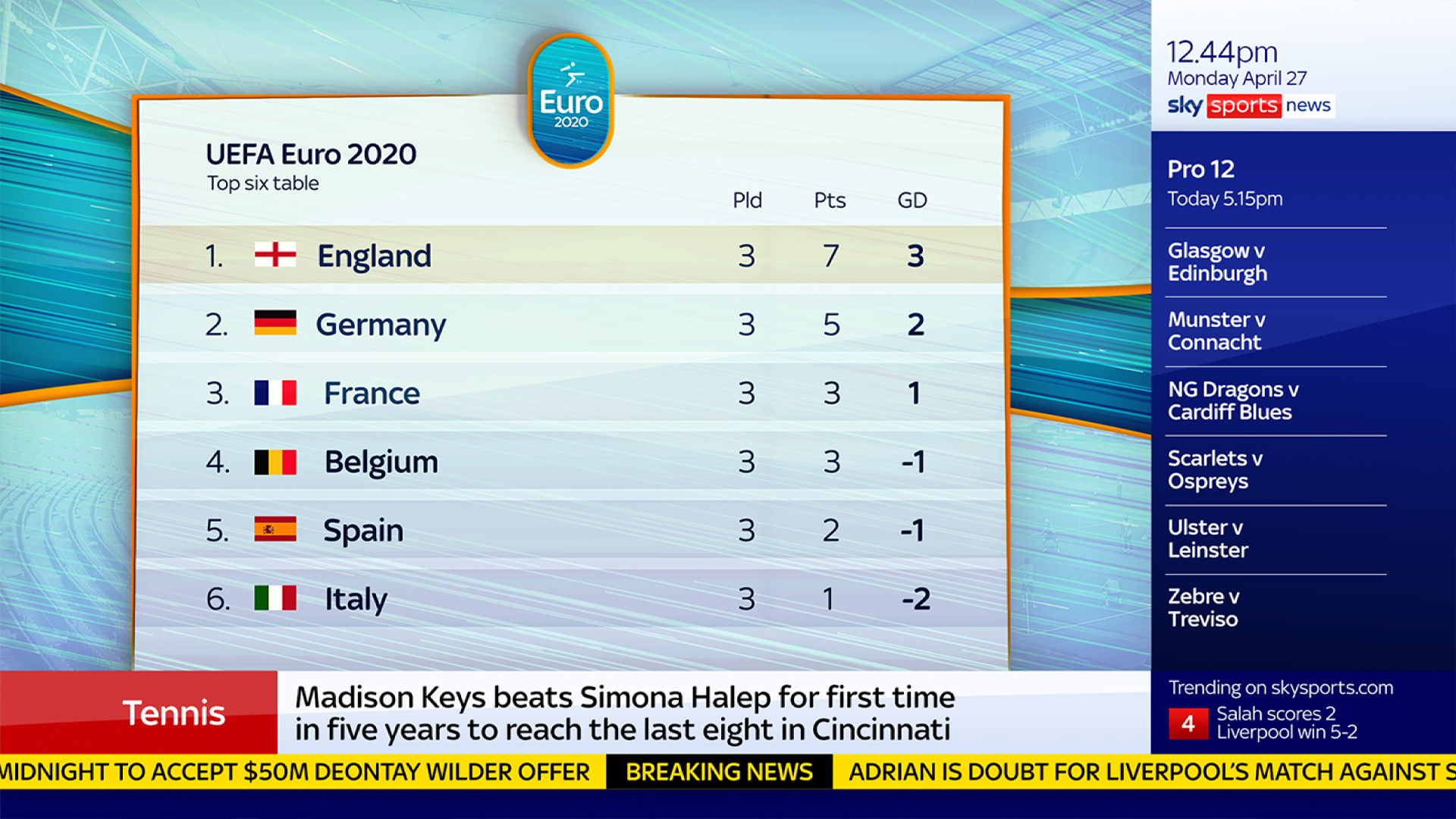
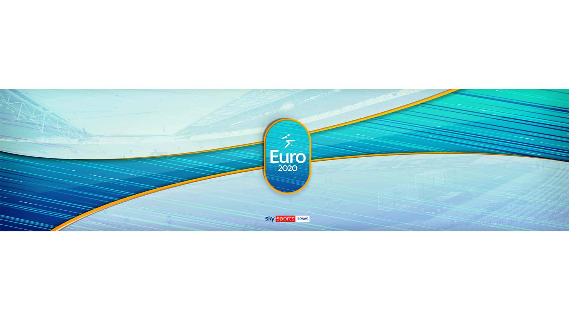
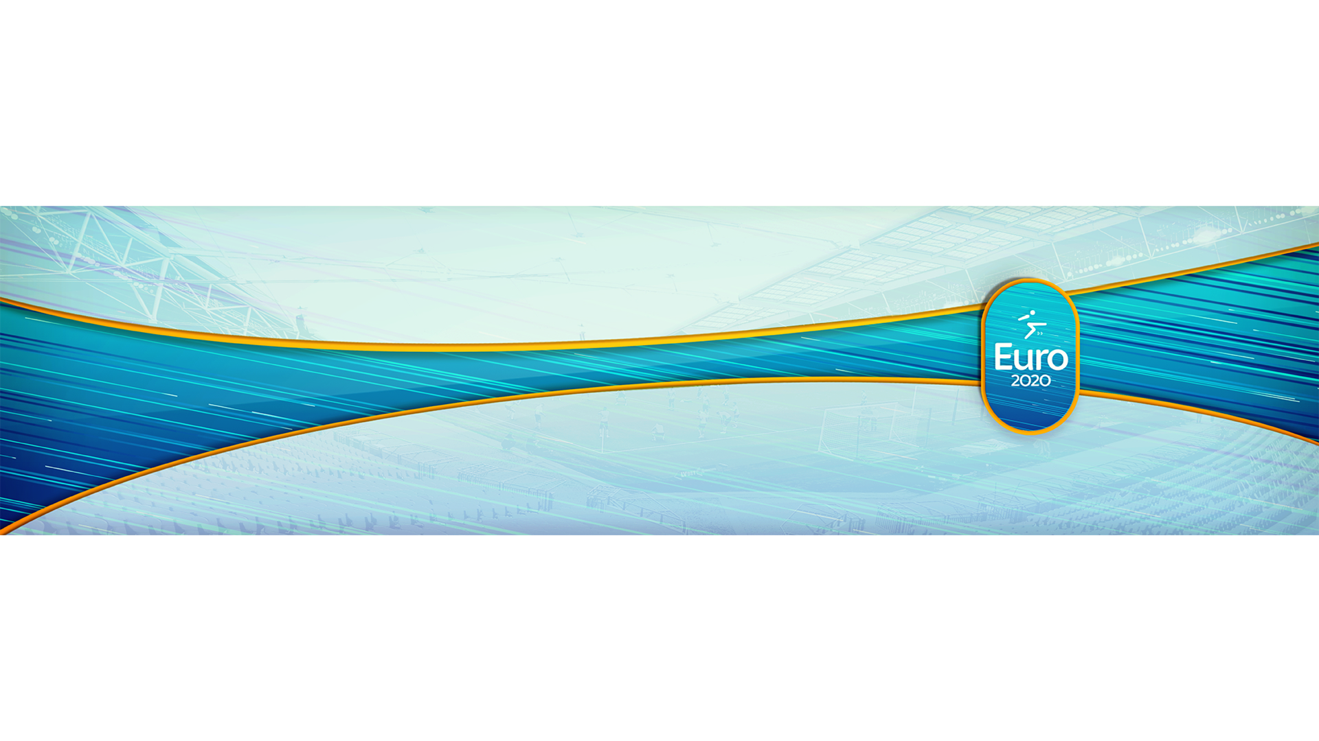
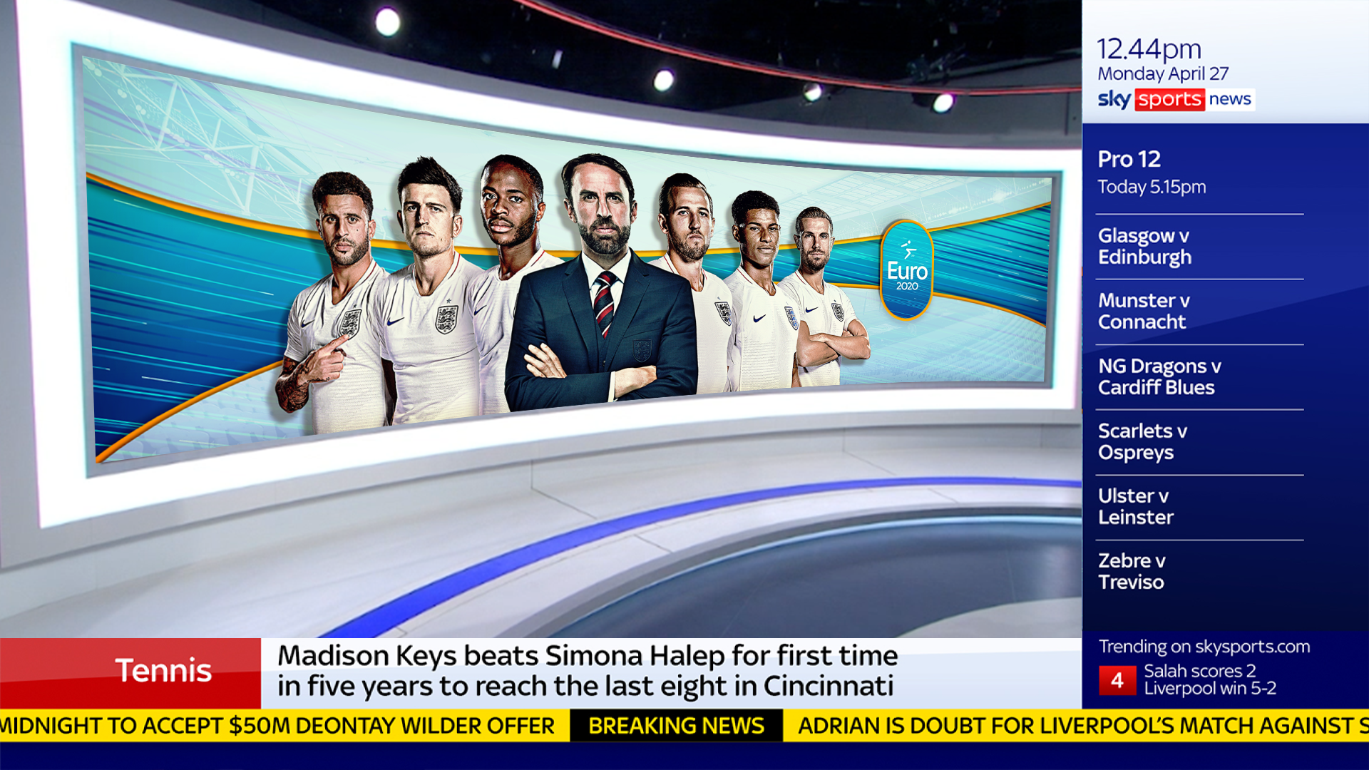
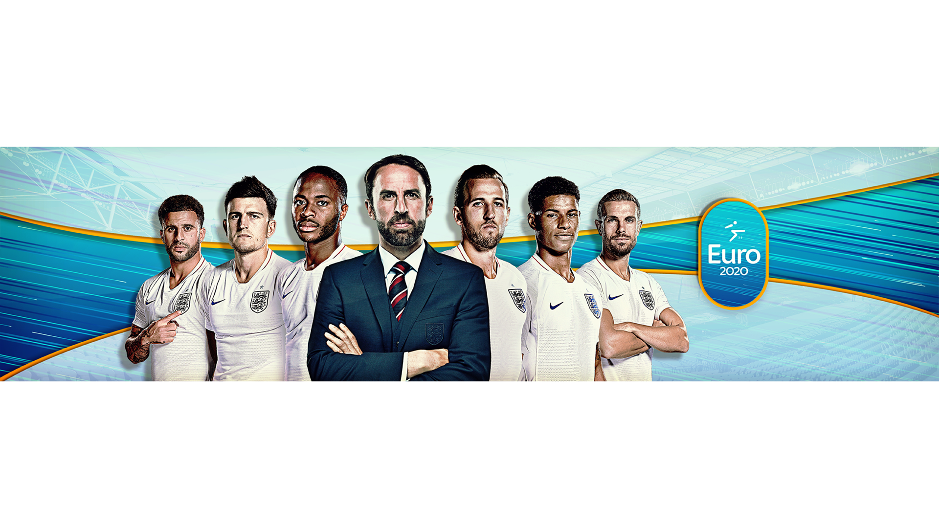
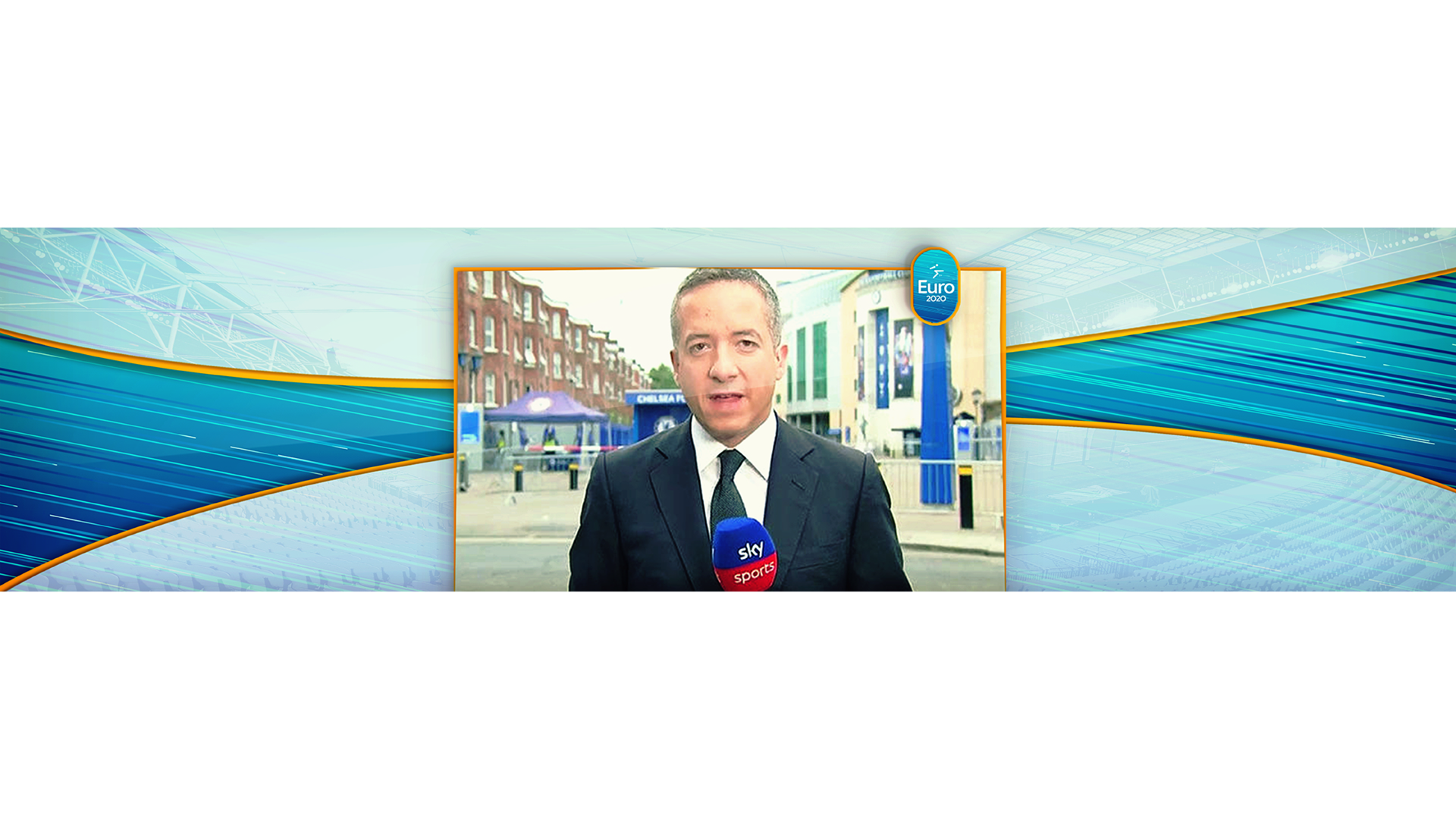
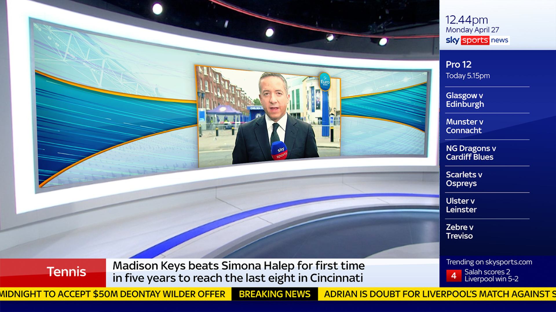
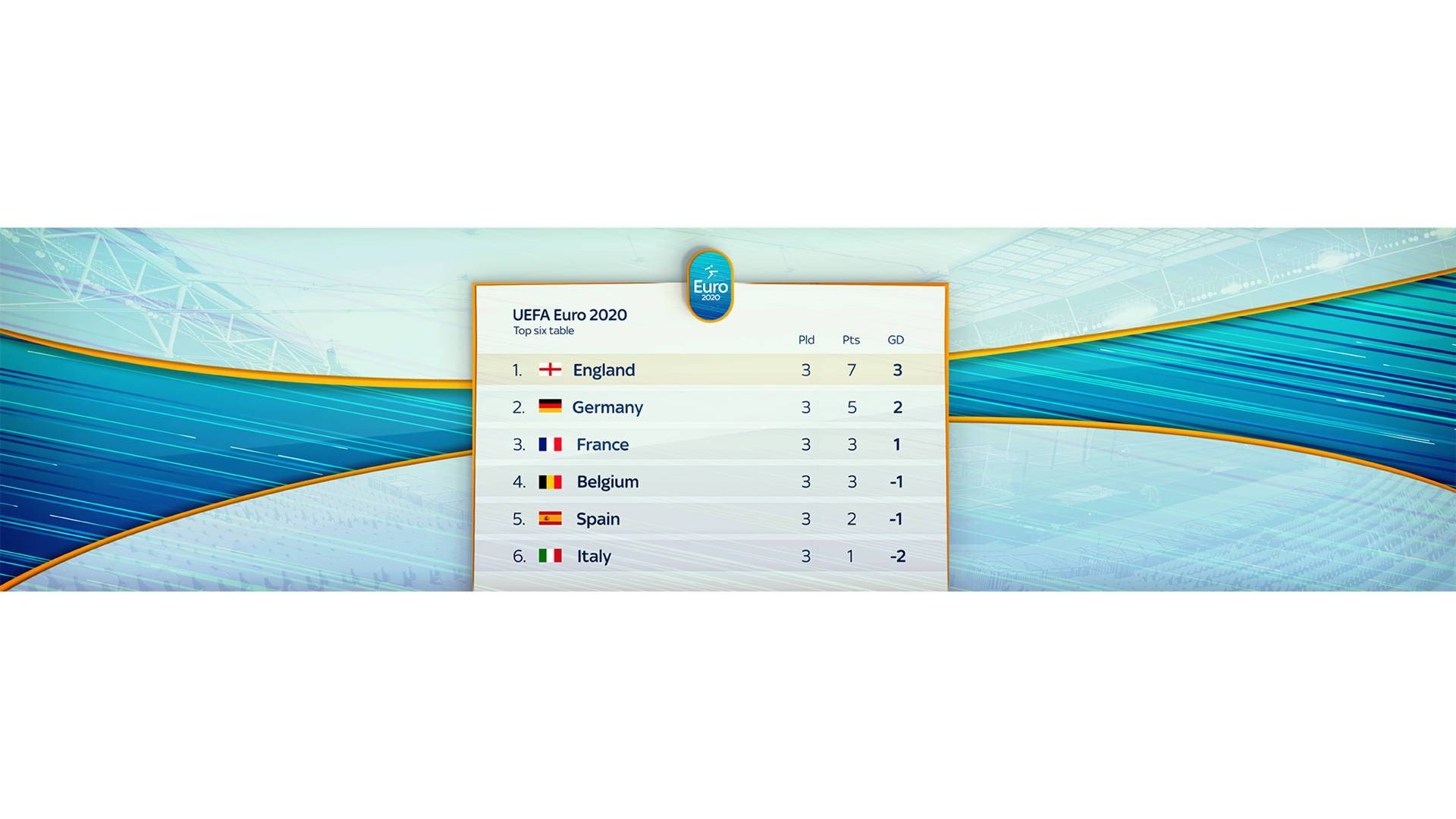
I took to their iconography and prevalence of the light blue which subtly hinted to our football branding colour style itself and so made an icon of a footballer as a nod to the original brand for Euro 2020. The colour palette was set with light blue to link to Euro 2020 with gold to signify prestige of the event as it is an event that occurs once every 4 years. The pattern of diagonal lines going across the graphics signify speed, adraneline and excitement.
Frames
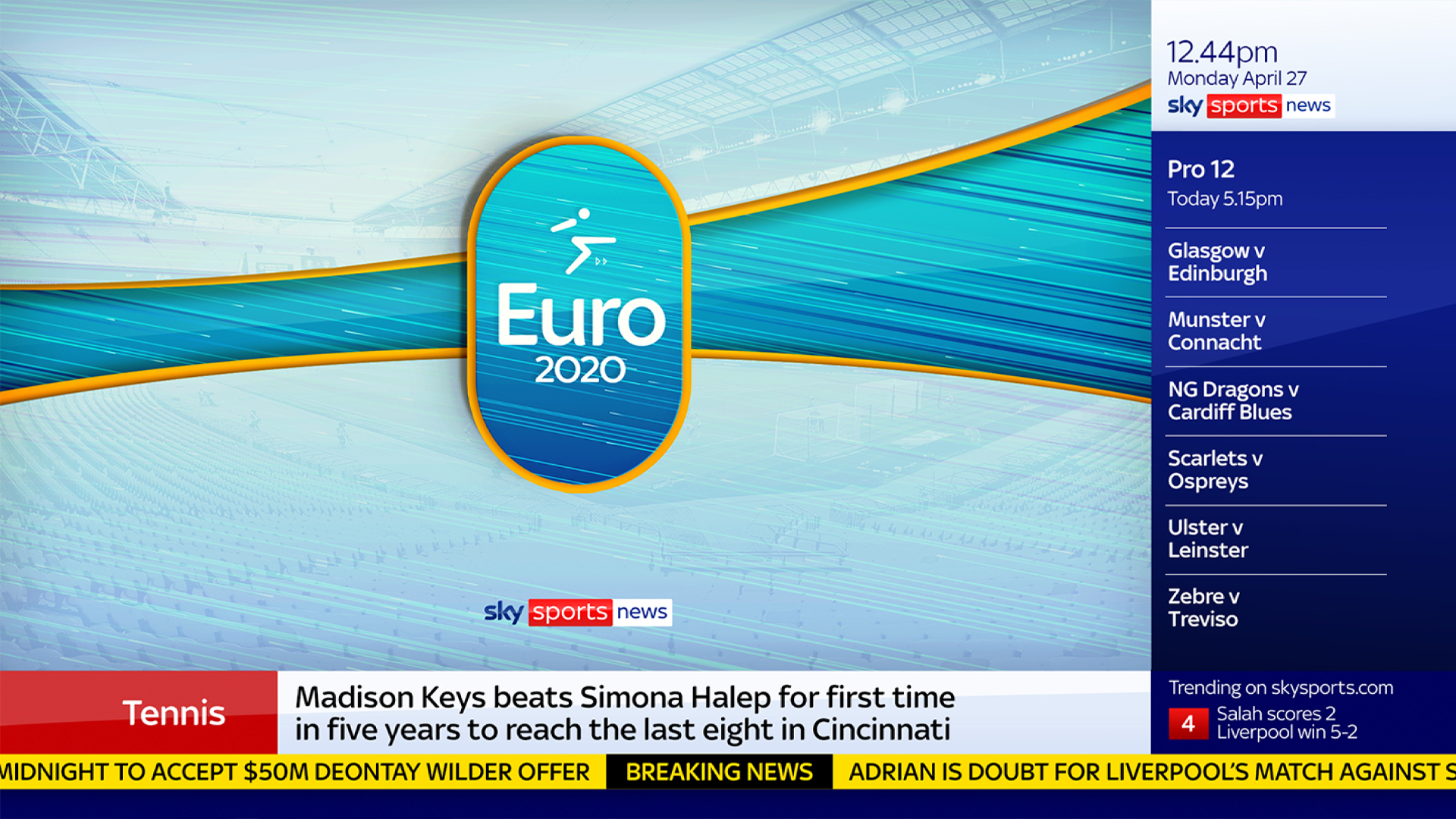
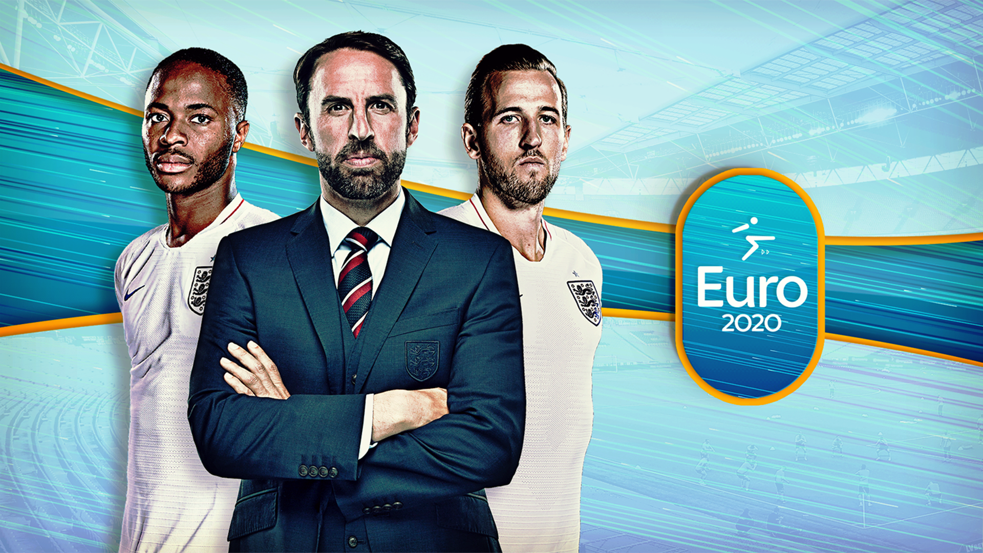
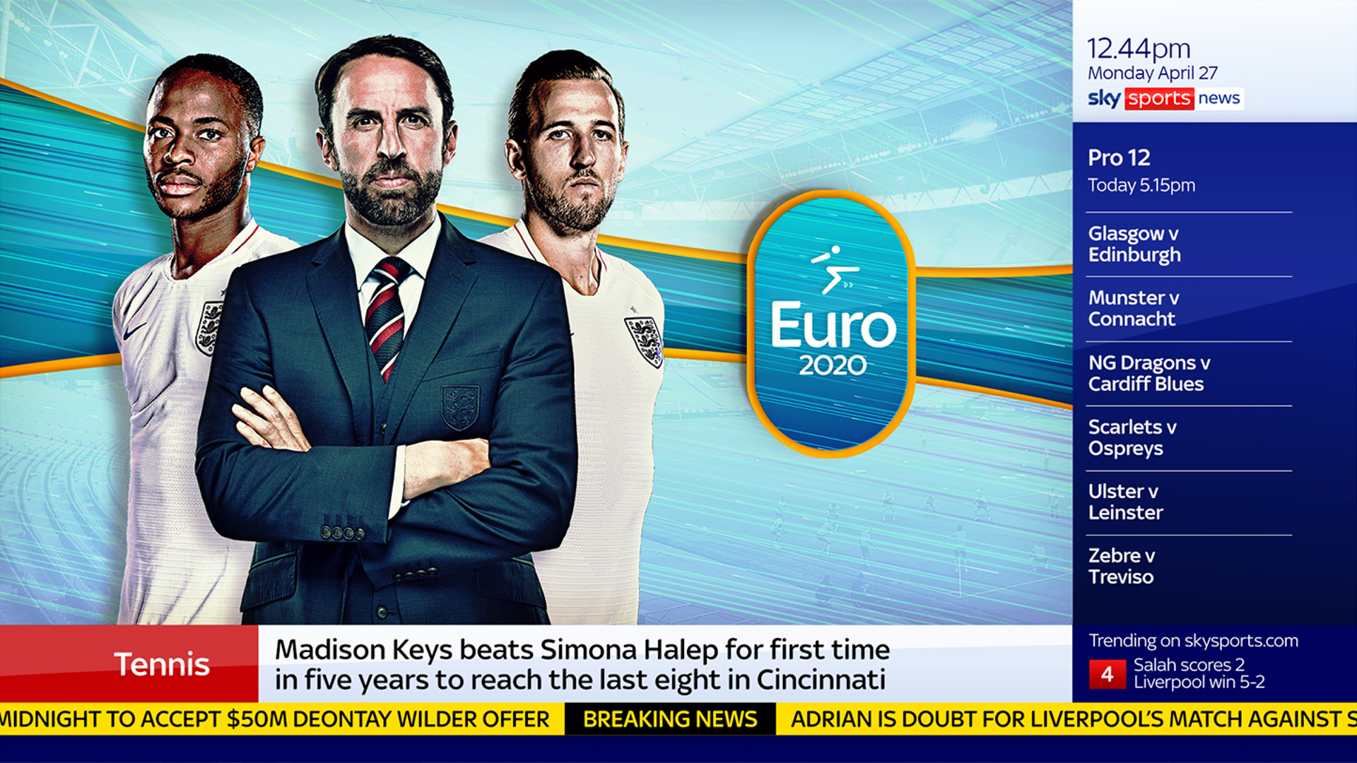
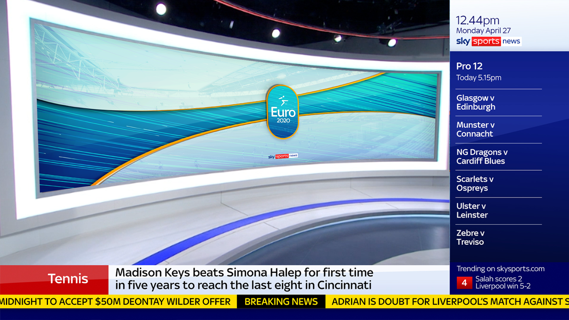
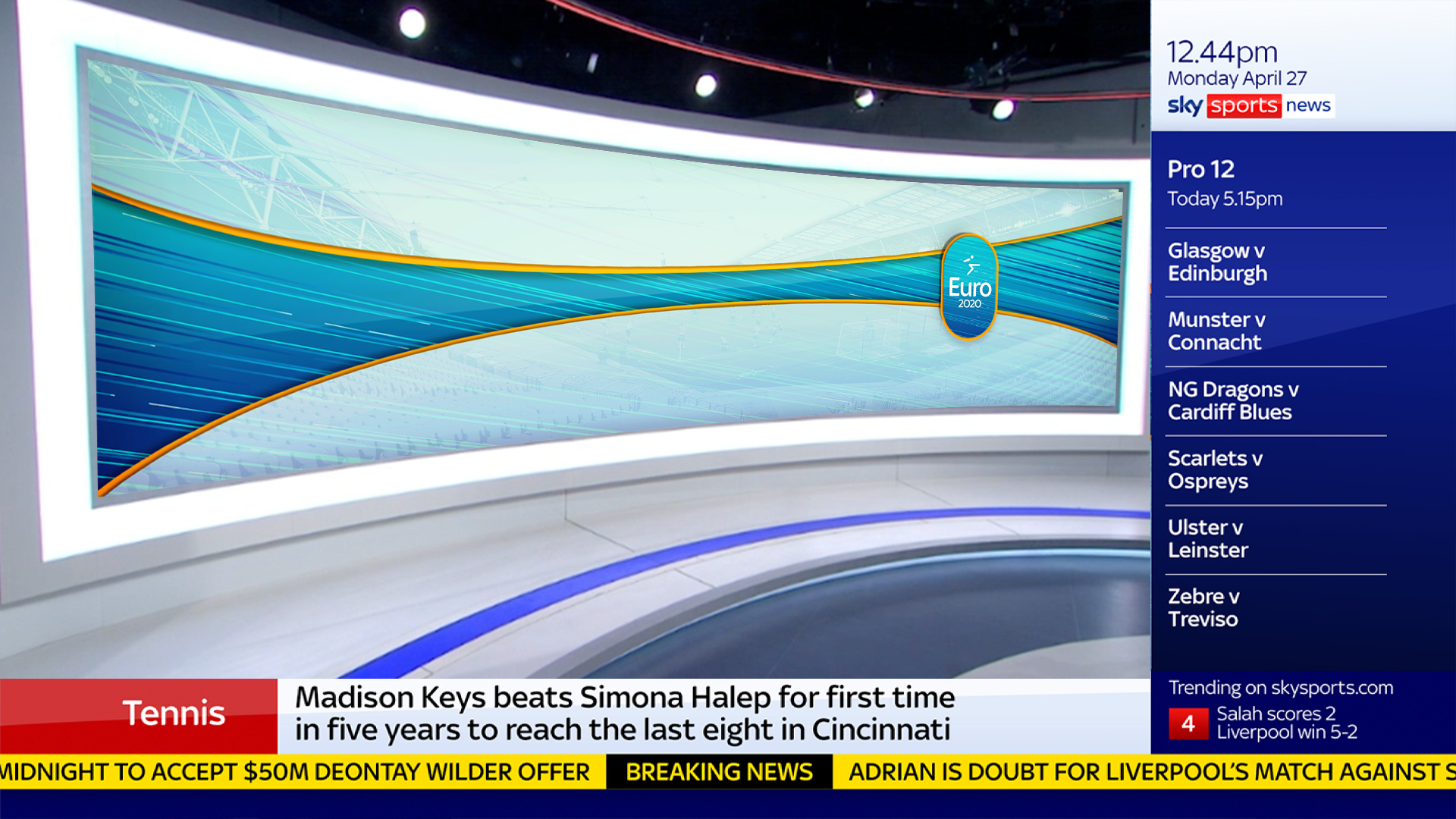
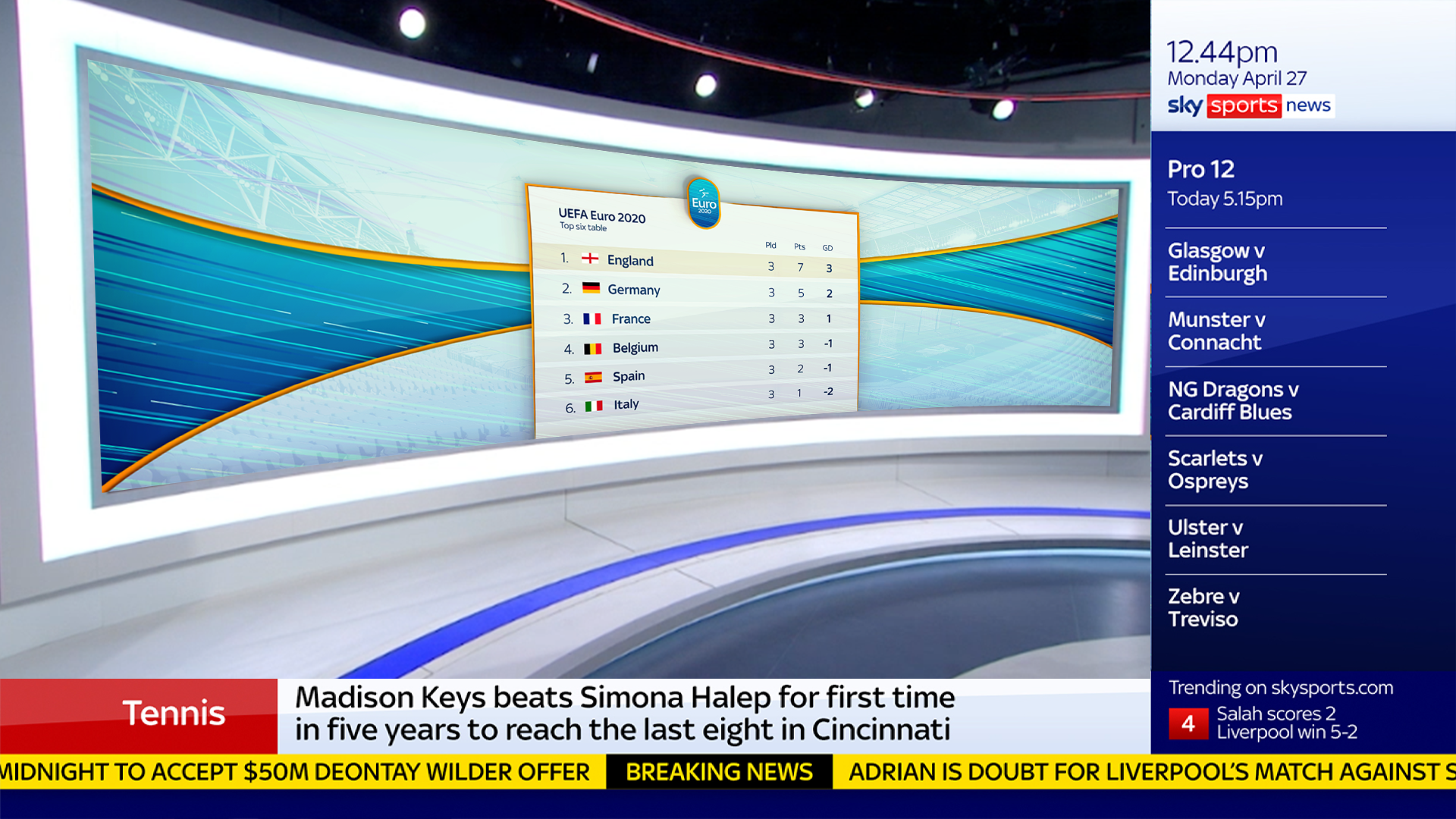
Below are full frames (1920x1080) and splashes tailored to fit full screen and the screens behind presenters on Sky Sports News hub wall.
What could have been better?
If you viewed our programmes for Euro 2020 you may have realised that if you squint they looked quite different on the channel than they do here.
Unfortunately, our pitch was not selected but looking back I can see much could have been improved, the main being the lack of flexibility in how information could be placed in our design. Given the nature of broadcasting being a high paced environment with other designers taking on your brand concept to create graphics, it is essential for our design to be as flexible and easy to utilise as possible along with being a solid brand.

