UX For Penny Appeal Microsite
Role: Lead UX Design
Client: Penny Appeal
Brief
We need a microsite dedicated to our Partnerships department.
Context
Penny Appeal is a charitable organisation which provides poverty relief across Asia, the Middle East, and Africa by offering water solutions, organising mass feedings, supporting orphan care and providing emergency food and medical aid.
Within the organisation I was the designer for their Partnerships/Philanthropist department whose purpose was to target clients who donate a hefty sum. These clients were placed in our VIP list and so got more insight into how their money was being used across the projects through reports. These clients were mostly located through events and fundraisers hosted by the Partnerships department.
Task
Being in the digital age and having a multitude of projects that always required attention which the department liked to highlight to our current and potential top tier donators, the stakeholders requested a microsite be created dedicated to the specific clientele.
For the purpose of this I worked on how the microsite can fit on the main Penny Appeal website while introducing a user friendly way for the clients to skim through appeals and make the organisation more legible through credentials.
User Interviews
Based on the findings from the Customer Journey Map, further analysis was performed by interviewing 11 of our current major donor clients. This was done through a face to face individual interview.
Demographics
Quick Questionnaire
Apart from Penny Appeal are you aware of any other charity organisations?
Do you donate to them as well?
How often do you donate and if it isn’t too personal a question how much in general?
How do you normally find out the information you need from us?
Do you access our information mainly through phone or laptop/desktop?
Do you use our website?
How easy is it to find the information you need about our appeals?
Are you happy with our current process of providing proposals?
If you can’t find the information you need, what do you do?
Which mode of contact do you prefer?
How easy is it to find our contact details?
Recurring Answers
Customer Journey Map
Goals and Motivation
Provide positive change in a communities
Wanting to eradicate social issues even if by a small percentage
Insights on the journey of a potential customer.
Context
The customer wanted to bring positive change in the world through monetary means so they went to find an appropriate charity for it.
Define
Hypothesis
I found pain points from the two most common responses which were:
“Getting proposals digital would be great so I’m not lugging physical documents around while on the move.”
“If I lose your contact information I wouldn’t know where to look aside from your general customer service number.”
These answers were a huge insight and strengthened the core needs aligning with the stakeholders wants. If we created a microsite then it would help users navigate through our products easier. Major bonus point would also be our contact information being easily accessible.
User personas
After qualitative examination, I defined 2 personas who were Penny Appeal clients, reflecting the weaknesses found it the interview.
Conclusion
Clients want information to be more accessible and also easy ways to contact through a direct line.
Competitor Analysis
How have the competitors integrated this system?
I conducted a competitors analysis researching the methods in which they acquire high paying donors. The insights was a great find as I found that none of our competitors used microsites or dedicated web pages for the specific customers, hence a gap in the market. Yay for us!
Problem Statement and Challenges
Researching pain points and problem statements.
The first pain point was how to add this service onto their primary website as there was an extensive amount of information that needed to be added while also being easy for the user to navigate through without being overwhelming. The official website was saturated with information overload.
Initial Sitemap
Revised Sitemap
After feedback on the first UI I revised the sitemap so simplify the user journey.
Wireframes
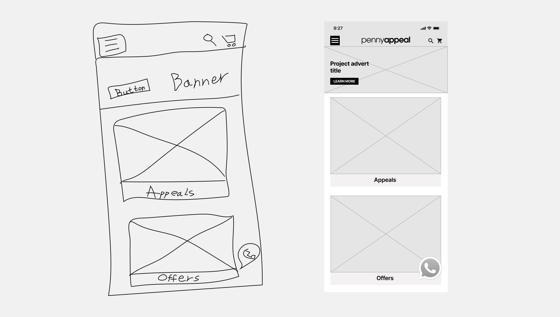
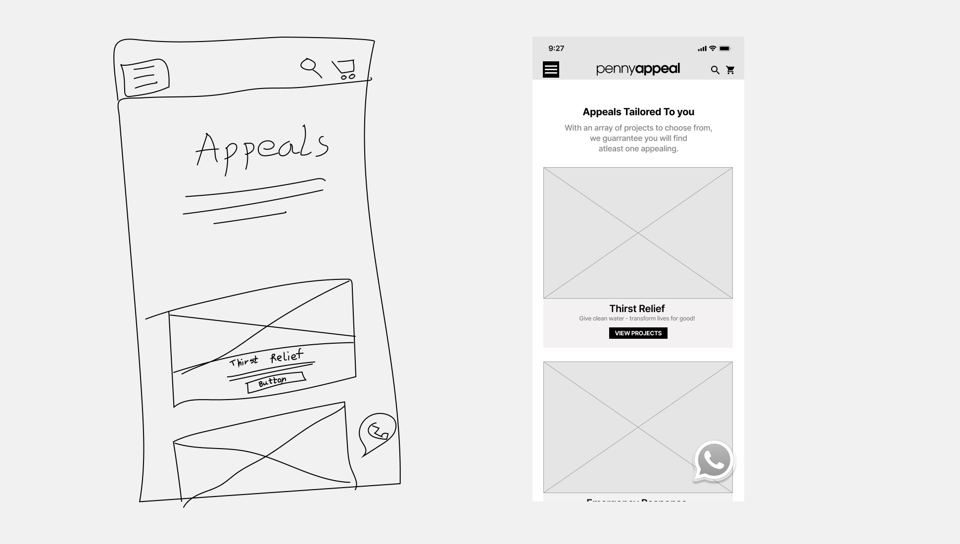
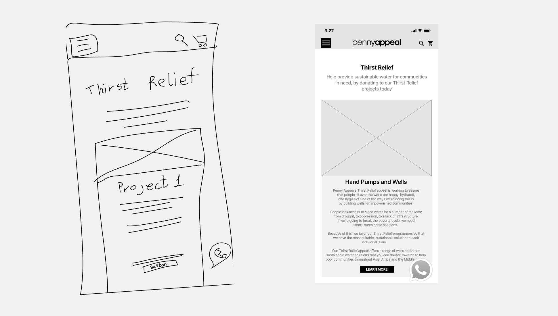
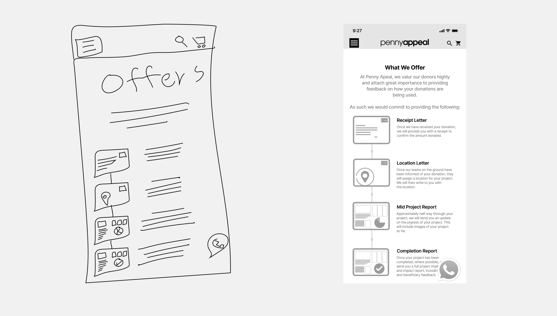
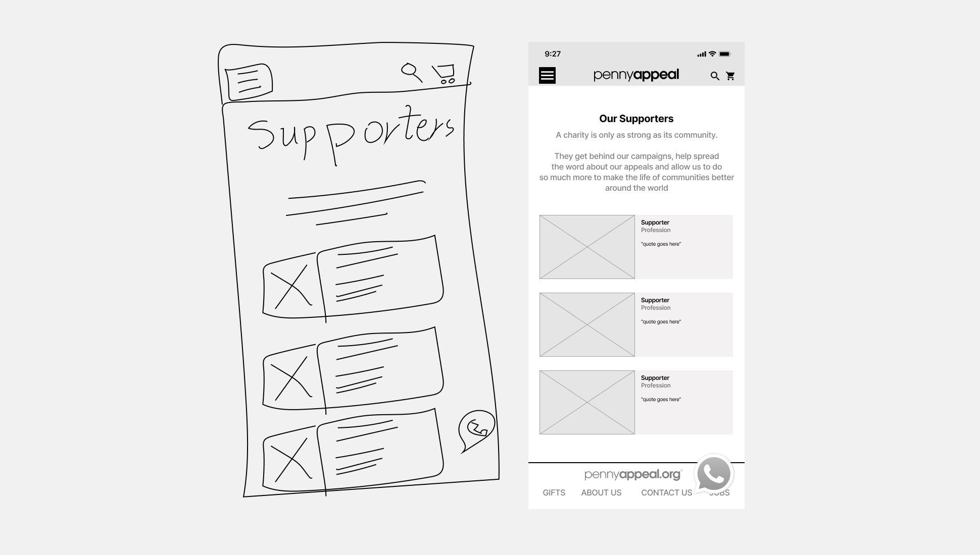
Initial UI Setup
This was the first design for the microsite which garnered positive feedback, however had a major flaw which was the way the appeals were being displayed as it became highly saturated and confusing for the user to navigate through the different types of appeals.
This was quite a challenge since the list of our appeals are hefty which grow day by day.
Current Features on website
What to take to mobile
The official website is teeming with information which leaves scarce room for our major donor clients. For this I did research on what elements of our website is essential to take to mobile.
As this is a bespoke microsite catering to our major donors we want to show them appeals that are personalised and cater to their preference. For this the main things that were taken from our official site were
The brand colours and logo
Site style
Visual Design
Much Reiteration to Deliverable
This was by far the closest to a successful microsite as it featured the list cleanly while also providing a banner prompt to push appeals we would like most attention on at that time.
From the research easy communication and being easily reachable was one of the pain point. With majority of our clients using Whatsapp, the feature was added which took them directly to the managers chat. Alternatively for those seeking contact through email, the feature was also provided using the red strap as a call to action towards it.
How it ended
With the prototype completed it was time for user testing and I soon learned that it was easy to navigate around BUT that was because only our staff (who are closely familiar with the ways of our organisation) were testing the product which created bias data collection.
What could have been better
Looking back much could have been improved. If I could do it over I would want to get involved earlier on in the research efforts so that the design could have a voice in guiding the project direction so that we could solve both the user and company pain points. I would have looked further into providing a personalised experience for the clients by having accounts they could log into and have the appeals proposed cater to their personal preference using an algorithm. Also the account would feature their documents digitally which could potentially overcome the issues with paper based proposals and reports provided for their chosen appeals.


